Houzz Kitchen of the Week: White & Wood
Houzz Kitchen of the Week
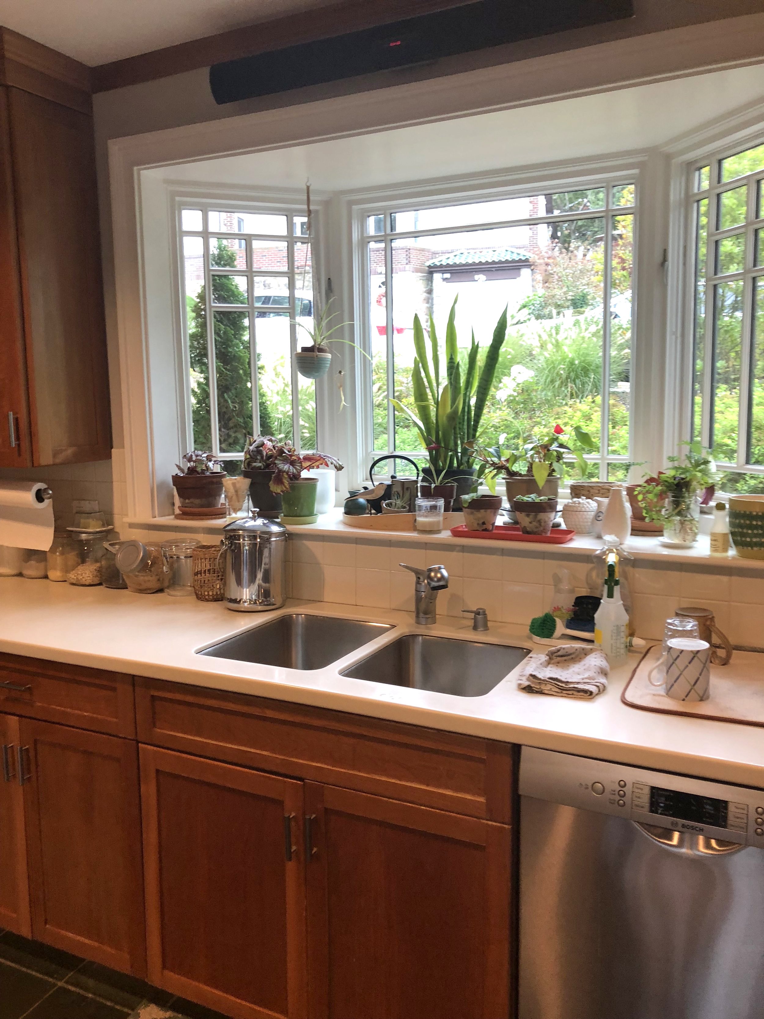
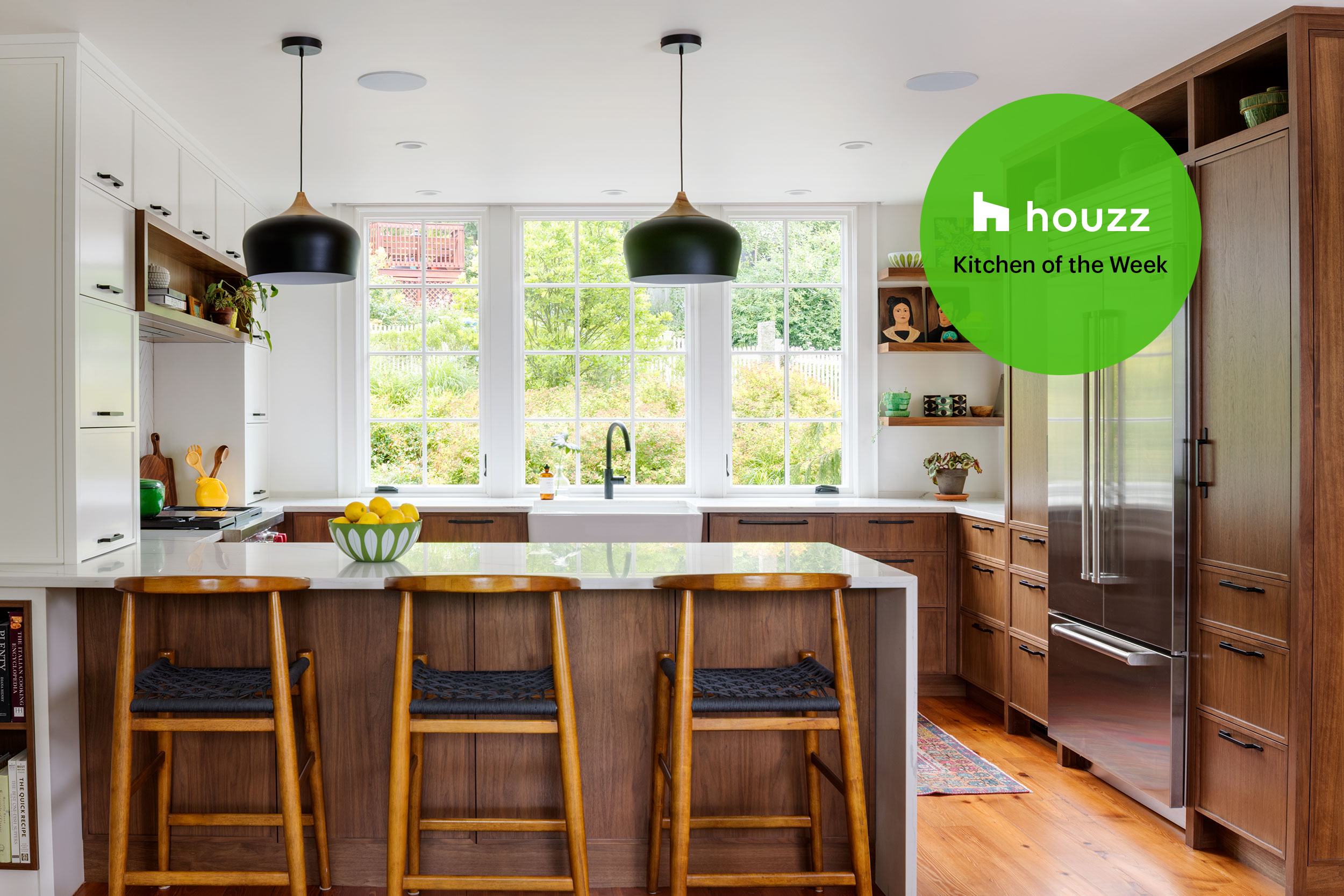
Great design deserves attention, so it comes as no surprise that our Moss Hill kitchen renovation has been chosen as the featured Kitchen of the Week on Houzz.com. As writer Jeannie Matteuci tells the story “Overall, this couple’s kitchen functioned fine. But several details and features added up to frustration. These included green porcelain tile flooring, a pair of decorative columns, beige backsplash tile, small windows, an awkward appliance layout, and inefficient storage and counter space. Wanting a brighter, more modern look and feel with a sensible layout that created space for their two kids and better views of a front garden, they turned to designer Beth Barter and builder Kevin Cradock. The remodeling team rejiggered the layout to create a G-shaped setup with a more practical appliance arrangement. A mix of white and walnut create a warm yet bright style. And enlarged windows let in the light and views.”
Here are the after and before images and the new floor plan. This kitchen was also featured in Boston Home.
More on this project here.
BEFORE photo
AFTER photo
Floorplan
Does your kitchen need reconfiguring? Let us find the perfect solution for your design challenges. Give us a shout and don’t forget, we serve eastern Massachusetts and greater Denver, Colorado.


